CHIRP-N-CRUNCH
PROJECT TYPE
Branding, Packaging Design
APPLICATIONS USED
Adobe Illustrator, Adobe Photoshop
THE CHALLENGE
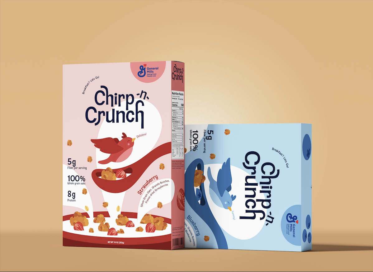
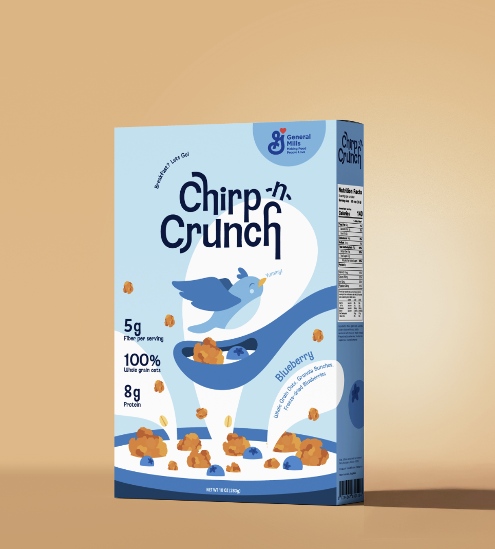
Many healthy cereals rely on muted colors and overly serious branding, making them easy to overlook on crowded grocery shelves. This conventional approach struggles to engage younger, more casual consumers looking for products that feel both wholesome and visually exciting.
THE SOLUTION
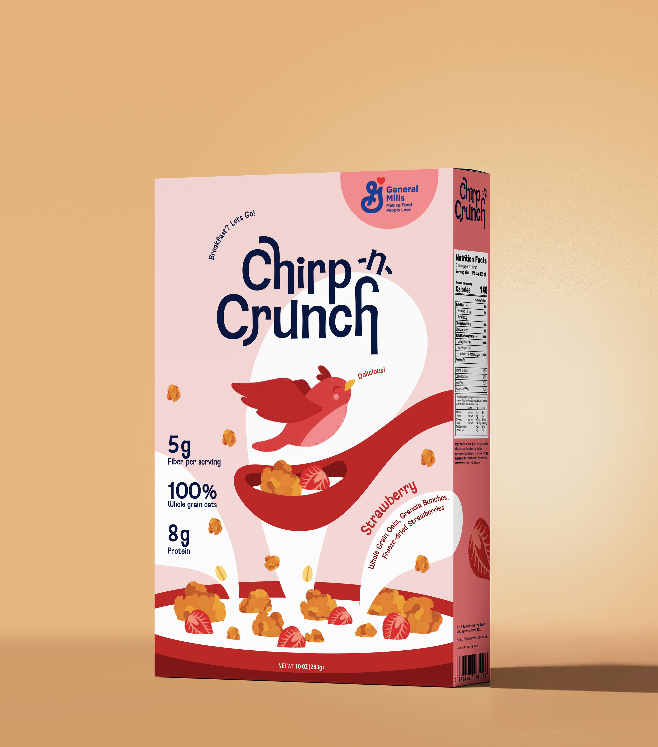
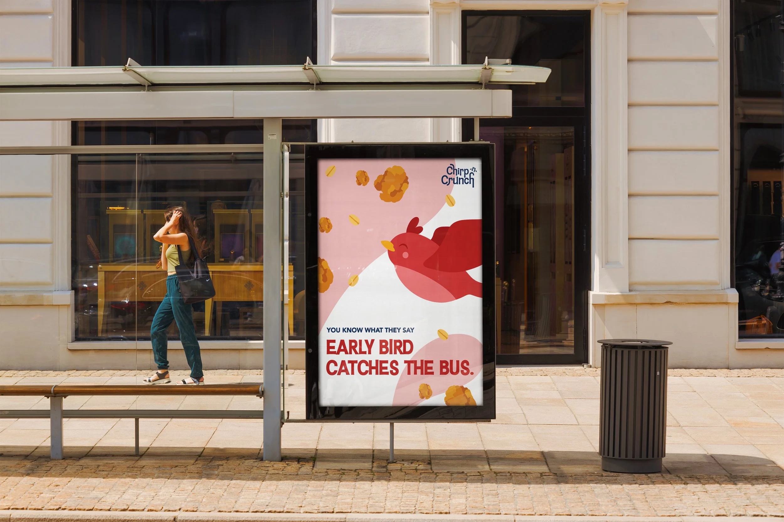
A playful, nature-inspired cereal brand that proves healthy doesn't have to feel boring. Through vibrant colors, expressive typography, and fruit-forward packaging, Chirp-n-Crunch transforms breakfast into an inviting experience. Available in strawberry and blueberry flavors, the identity balances organic ingredients with youthful energy to create packaging that feels fresh, nourishing, and full of personality.